
When we think about website optimization, text-based elements like titles, headings, and internal linking structures often hog the spotlight. However, the heavy visual assets on your pages quietly dictate your site’s actual organic success. Unoptimized images act as an anchor on your loading speeds, tanking user experience metrics and hindering your search visibility.
Mastering image delivery is no longer just a luxury task for web design teams. In today’s search landscape, Image Optimization for Technical SEO has emerged as a fundamental pillar of performance engineering. If you want to rank higher, keep bounce rates low, and outpace your competitors, you must optimize your visual assets systematically.
1. Why Image Optimization is a Core Technical SEO Pillar
Images make up a massive portion of modern web page real estate. When Google crawls a website, it evaluates not just what is written, but how fast and stable that content renders for a human visitor. This is where user experience and technical search architecture intersect directly.
The Core Web Vitals Impact
Google uses Core Web Vitals as an explicit ranking factor to quantify user experience. High image payloads directly damage your Largest Contentful Paint (LCP) score, which measures how quickly the main content of a page loads. If your hero image takes five seconds to appear on mobile devices, your LCP score will fail Google’s benchmarks.
Furthermore, images without defined dimensions trigger bad Cumulative Layout Shift (CLS) metrics. When an image loads late and suddenly forces text to jump down the screen, users get frustrated. Google recognizes this erratic movement as a sign of poor development quality and penalizes your rankings accordingly.
The “Weight” of the Web
Data from the HTTP Archive consistently shows that images contribute to over 40% of an average web page’s total file weight. While scripts and stylesheets have shrunk due to advanced minification techniques, image sizes continue to swell as cameras capture more detail. This data makes it clear that unoptimized media is typically the single biggest bottleneck for site performance.
When mobile browsers look at an unoptimized landing page, they are forced to pull down megabytes of data that could easily be reduced to kilobytes. This extra weight drains battery power, consumes cellular data, and increases data parsing latency.
The UX-SEO Correlation
Slow-loading visual elements create a terrible first impression that drives visitors away. When a page hangs while trying to load large files, users naturally bounce back to the search engine results pages (SERPs). This sends a direct signal to search engines that your page did not satisfy the user’s intent.
Conversely, fast-loading images improve time-on-site metrics and push up conversion rates. By reducing your file sizes, you provide an instantaneous browsing experience that helps keep users engaged with your content.
2. Navigating the Next-Gen Image Landscape (WebP vs. AVIF)
For decades, JPEGs and PNGs were the undisputed kings of web graphics. JPEGs were used for rich photographic scenes, while PNGs handled graphic assets that needed transparent backgrounds. However, these legacy formats are no longer efficient enough to satisfy modern technical criteria.
Beyond JPEG and PNG
Legacy formats carry heavy internal structural data that makes them poorly suited for the modern web. JPEGs lack support for transparency and often become blurry or blocky when compressed aggressively. PNGs support incredible lossless quality, but their file sizes scale exponentially, making them far too heavy for complex website layouts.
To fix these structural limitations, modern web standards introduced next-gen image formats. These formats use advanced encoding algorithms to deliver pristine visuals at a fraction of the historical file size.
WebP vs. AVIF Performance
WebP was developed by Google and has become a universally adopted modern standard. It provides both lossy and lossless compression, saving around 25% to 34% in file size compared to equivalent JPEG files. It allows websites to load media much quicker without sacrificing visual fidelity.
AVIF is an even newer format derived from the open-source AV1 video codec. AVIF offers up to 20% to 30% better compression efficiency than WebP, rendering exceptionally clean details in highly compressed environments.
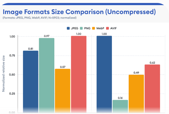
As shown in the data above, next-gen alternatives consistently lower the byte footprint compared to legacy file types, making them essential for high-performance sites.
The Alpha Channel & Transparency
Handling transparent elements used to mean using massive PNG-24 files. Fortunately, both WebP and AVIF support an alpha channel natively while using much more efficient lossy compression algorithms. This means you can display transparent product cutouts or intricate graphics without bloating your layout weight.
Switching your transparent assets from PNG to WebP or AVIF can reduce individual file sizes by up to 80%. This small file type shift dramatically clears up bandwidth bottlenecks on content-heavy pages.
Fallback Mechanisms
While modern browsers widely support WebP and AVIF, you still need to account for older legacy clients. You can manage this by utilizing the HTML <picture> element to serve next-gen assets while providing a safe fallback.
<picture> <source srcset="image.avif" type="image/avif"> <source srcset="image.webp" type="image/webp"> <img src="image.jpg" alt="Optimized example graphic" width="800" height="600"> </picture>
The browser evaluates this block sequentially, loading the AVIF file if it supports it, defaulting to WebP next, and fallbacking to the standard JPEG if all else fails. This safety net keeps your design looking perfect on all user screens.
3. Lossy vs. Lossless Compression: Striking the Technical Balance
Understanding how file compression works allows technical SEO to make informed choices during asset preparation. You do not always need perfect, unedited pixels to satisfy web users.
Defining the Mechanics
Lossy compression works by permanently discarding unnecessary or less perceptible visual details from the file. It targets subtle color variations that the human eye struggle to differentiate. Lossless compression, on the other hand, preserves every single bit of original pixel data, simply rewriting the file structure more efficiently.
While lossless compression keeps your original master files intact, it rarely reduces file sizes enough for rapid web delivery. For online performance, lossy compression is almost always the preferred choice.
The “Sweet Spot” Metric
The goal of optimization is to find the exact point where file sizes drop drastically without causing noticeable pixelation. For most web JPEGs or WebP files, setting a compression quality level between 75% and 85% is ideal.
At this level, files drop up to 80% of their weight, yet the visual difference is invisible to the average reader. This simple adjustment preserves your aesthetic appeal while yielding major speed gains.
Automated Tooling and Pipelines
Manually compressing hundreds of images through web apps is inefficient for scaling businesses. Technical teams should integrate automated compression pipelines directly into their build systems using libraries like Imagemin or Sharp.
If you are running a modern JavaScript framework, plugins for Webpack or Vite can convert and compress images during the production build step. For traditional content management platforms like WordPress, server-side plugins can handle these conversions automatically upon upload.
Stripping Metadata
When a digital camera takes a photograph, it embeds hidden EXIF metadata into the file structure. This data includes camera models, lens settings, GPS coordinates, and creation dates. While useful for professional photographers, this metadata adds dead weight to your web pages.
Configuring your compression tools to strip EXIF metadata is an easy win for your team. Clearing out this invisible data can save several kilobytes per file, speeding up crawl efficiency over thousands of images.
4. Advanced HTML Delivery: Responsive Images and Lazy Loading
Choosing the right format and compression quality is only half the battle. You must also ensure your HTML delivery mechanism is smart enough to adapt to diverse screen configurations.
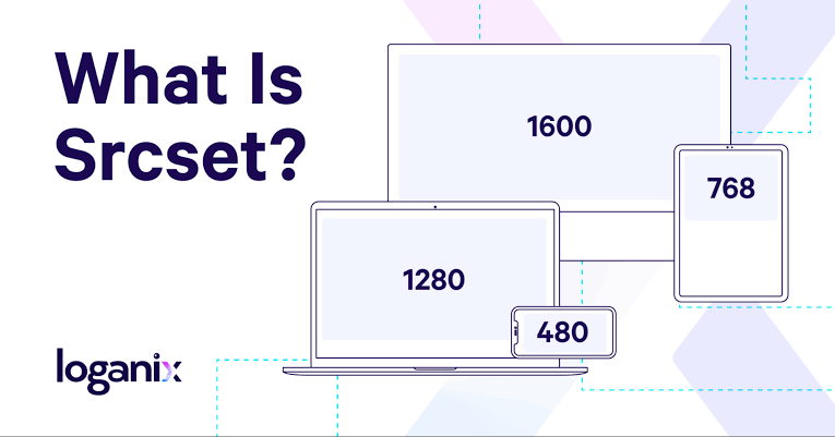
The browser reads the available display layout and downloads the specific asset size that matches the device’s physical screen requirements. This prevents mobile users from wasting bandwidth on hidden desktop pixels.
Native Lazy Loading
The native loading="lazy" attribute tells the browser to delay downloading off-screen assets until the user scrolls close to them. This dramatically reduces the initial page load time, especially on long, image-heavy blog posts.
Implementing lazy loading reduces initial server overhead and allows critical text and layout code to render first. It ensures your users can start reading your written content without waiting on media assets hidden at the bottom of the page.
The LCP Exception
While lazy loading is excellent for lower content blocks, applying it to above-the-fold assets is a major SEO mistake. If you lazy load your primary hero element, the browser delays downloading it, which ruins your LCP score.
<!-- High priority above-the-fold hero image -->
<img src="hero.webp" fetchpriority="high" alt="Main product showcase" width="1200" height="630">
Always leave lazy loading off your topmost visuals. Instead, append the fetchpriority="high" attribute to signal to the browser that it should fetch the hero asset immediately.
Preventing Layout Shifts
To protect your site from bad CLS layout shifts, always explicitly state width and height attributes on your image elements. These numbers do not lock your layout to a rigid pixel size; instead, they allow the browser to calculate an aspect ratio box beforehand.
By reserving the correct layout box ahead of time, the browser prevents incoming images from shifting surrounding elements around as they load. This smooth rendering pattern keeps your user interface stable and protects your Core Web Vitals standing.
5. Edge Architecture: Leveraging CDNs for Real-Time Optimization
As your website scales globally, handling image variations on a central origin server becomes an expensive infrastructural hurdle. Deploying an edge architecture solves this problem cleanly.
The Role of Image CDNs
A Content Delivery Network (CDN) stores copies of your media files across an interconnected global fabric of edge servers. When a user visits your site, the assets are delivered from the physical server closest to them, eliminating long-distance network latency.
Specialized image CDNs take this a step further by offloading compression and resizing tasks from your main web server. This ensures your primary hosting instance can focus on executing database queries quickly.
Dynamic On-the-Fly Manipulation
Modern image CDNs allow developers to transform graphics dynamically using simple URL parameters. By adding query strings to your media paths, you can tell the CDN to resize, crop, or reformat an asset on its edge layer.
Plaintext
https://cdn.digitalromans.com/images/product.jpg?width=400&format=avif&quality=80
The CDN checks its edge cache for that specific variation. If it does not exist yet, the edge server builds it on the fly, caches it for future users, and serves it instantly.
Caching Strategies & Edge Servers
To get the most out of your edge network, configure long-lasting caching headers for your visual content. Since your creative design assets rarely change, setting a Cache-Control header with a max-age of one year tells the browser and CDN to keep reusing the file.
Using the immutable directive in your cache headers tells the client that the asset will never update under that specific filename. If you need to roll out a new visual version, change the filename string to bypass old caches safely.
6. Structural Image SEO: Crawling, Indexing, and Structured Data
Technical asset preparation also requires establishing clean contextual signals so search engine spiders can index your visual media accurately.
Descriptive File Naming
Search engine web crawlers rely heavily on filenames to deduce what an image represents. Leaving your assets named with default camera strings like IMG_9482.png throws away an excellent opportunity to build topical context.
Rename your assets using clear, lowercase, hyphen-separated phrases before uploading them to your server. A file named image-optimization-technical-seo.webp is highly descriptive and tells the search engine exactly what to expect.
Contextual Alt Text
The alt attribute provides an alternative textual description of an asset for search engine bots and visually impaired users using screen readers. Good alt text should describe the visual content clearly while naturally incorporating relevant vocabulary.
Avoid keyword stuffing within alt tags, as this looks manipulative to search algorithms and breaks accessibility compliance rules. Focus on writing clean, helpful descriptions that provide genuine value to someone who cannot see the screen.
Image Sitemaps
If your website relies on complex client-side JavaScript frameworks to load dynamic elements, search engine bots might miss your images during initial crawls. Creating an XML image sitemap guarantees that search crawlers discover every media file on your domain.
You can append image tags directly to your existing XML sitemap layout or host a separate image index file. This technical step ensures deeper indexation paths across your entire domain.
Schema Markup
Using structured data code markup helps search engines interpret the components of your pages more effectively. By nesting ImageObject schema within your Article or Product markup arrays, you give engines specific details like creator data, licenses, and dimensions.
JSON
{
  "@context": "https://schema.org",
  "@type": "ImageObject",
  "url": "https://digitalromans.com/images/seo-guide.webp",
  "width": "1200",
  "height": "630",
  "caption": "Comprehensive Image Optimization Blueprint"
}
This structural clarity improves your chances of earning rich image snippets and prominent positions within Google Image search results.
7. Auditing and Monitoring Image Performance at Scale
Optimizing your site once is great, but maintaining fast speeds requires setting up automated monitoring systems as new content rolls out.
Auditing Tools
Regularly audit your domain using tools like Google Lighthouse and PageSpeed Insights to uncover unoptimized elements. These platforms highlight missing dimensions, legacy extensions, and excessive payload sizes.
For large enterprise sites, utilize a desktop crawler like Screaming Frog to audit thousands of URLs simultaneously. You can filter your bulk crawls to show images missing alt attributes or those exceeding a specific file size threshold (like 100KB).
Continuous Integration Monitoring
The most reliable way to maintain a fast site is to block unoptimized media from hitting your production server in the first place. You can set up performance budgets within your GitHub repository or deployment pipelines to run automated audits on every code push.
If a developer accidentally commits a raw, uncompressed 5MB photograph to the repository, the automated check will fail the build. This preventive measure stops performance regressions before they ever affect real users.
Key KPI Checklist
Keep your engineering team aligned by tracking a core set of operational metrics regularly:
- Largest Contentful Paint (LCP): Keep this core score under 2.5 seconds.
- Cumulative Layout Shift (CLS): Target a stable structural score under 0.1.
- Total Image Payload Size: Aim to keep the collective media size under 500KB per page view.
- Image Crawl Errors: Watch for 404 broken media URLs in your Google Search Console dashboard.
8. Conclusion & Actionable Next Steps
A truly fast web architecture requires a unified optimization strategy. By combining next-gen formats like WebP and AVIF, utilizing smart automated compression pipelines, and deploying assets via global image CDNs, you create a fast, resilient site.
Remember, investing in Image Optimization for Technical SEO serves both search engines and human readers. It ensures search bots can crawl your pages efficiently while delivering an instantaneous browsing experience that keeps users coming back.
Take a moment to analyze your home page with a modern speed testing tool right now. Identify your heaviest media files, convert them to next-gen formats, and watch your loading speeds and search signals improve.